My Role
UI/UX Designer
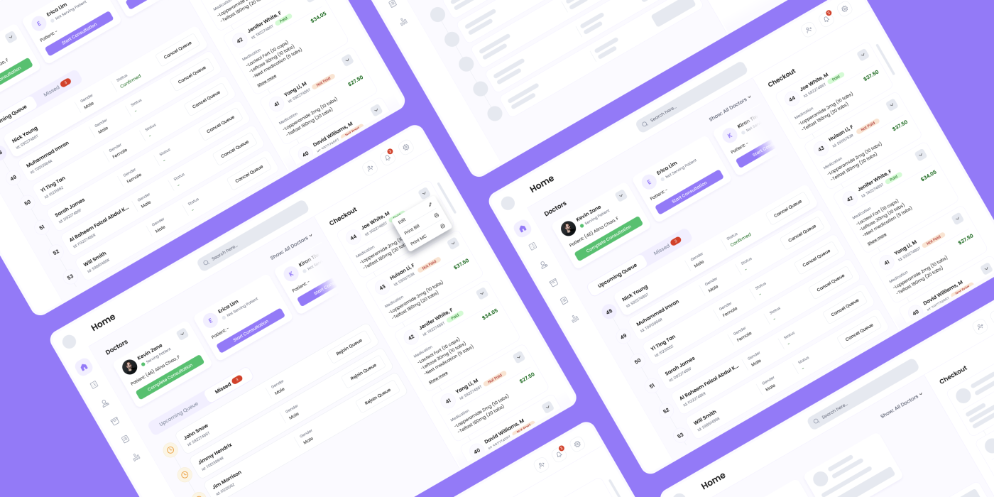
I worked on the Home layout that will be used by clinic staffs in small private General Practitioner (GP) clinics to manage their workflows.
Overview
Problem Statement
Clinic staffs in small private General Practitioner (GP) clinics have hard time managing their frequently encountered workflows.
Solution
Provide a user friendly, centralized place for clinic staffs to manage and view frequently-encountered workflows.
The journey and process
With initial research, benchmarking, Information Architecture, wireframes, Lo-Fi variations and Hi-Fi variations, I performed a good amount of design exercise to create the home page. Since I had fairly less timeline for the project, I had to skip some of the design process.

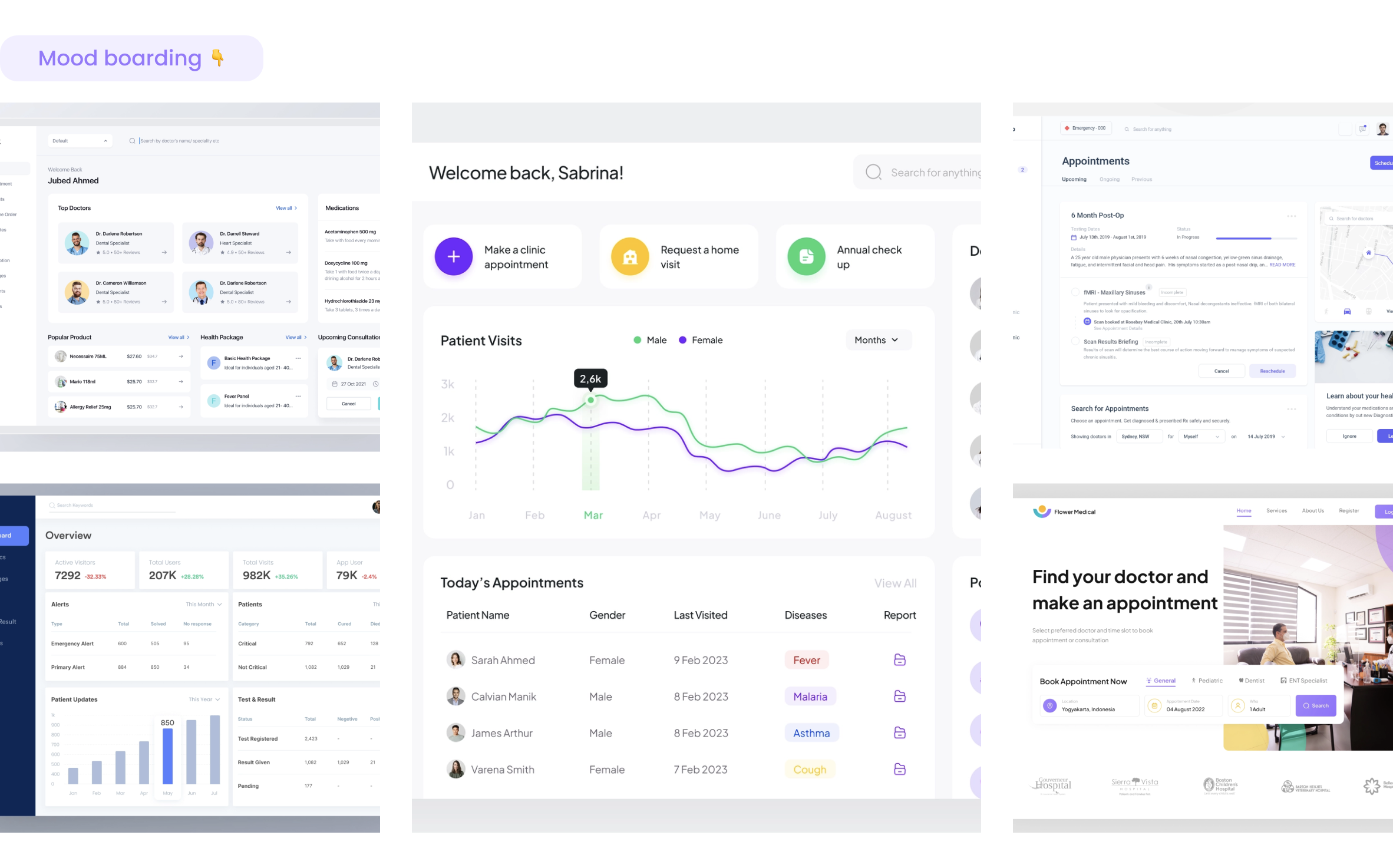
Mood boarding
I gathered inspirations from various sources online on similar domains. Moreover, I looked into some additional domains for inspiration on structure and layout and created a mood board.
Wireframes
I did the Information Architecture in the paper for faster delivery of the project. Also, I went through the requirement for this project and started creating rough wireframes initially in paper and quickly jotted it down in the Figma file so that it is easier for me to visualize the structure and layout for the screens. 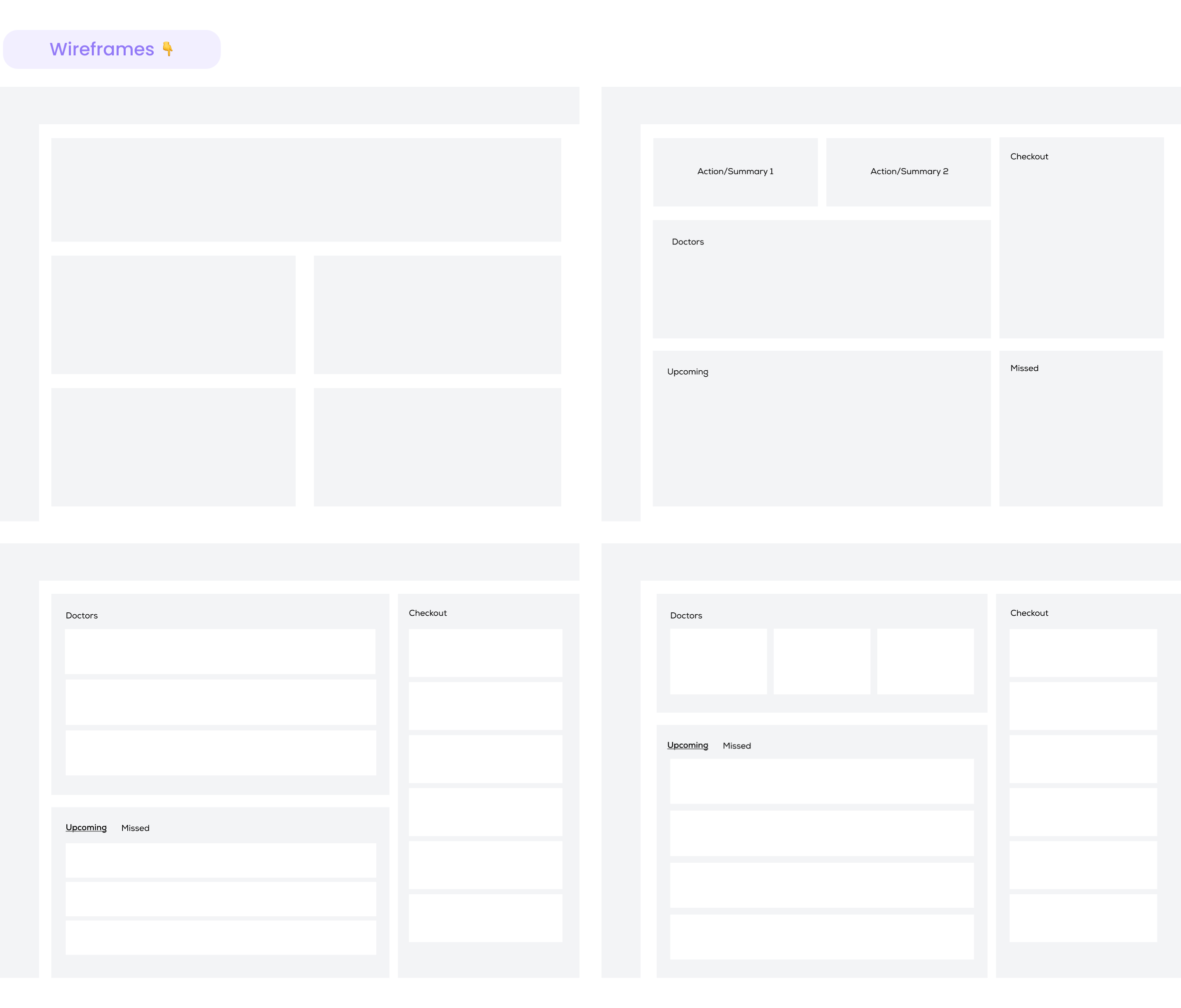
Lofi Variations
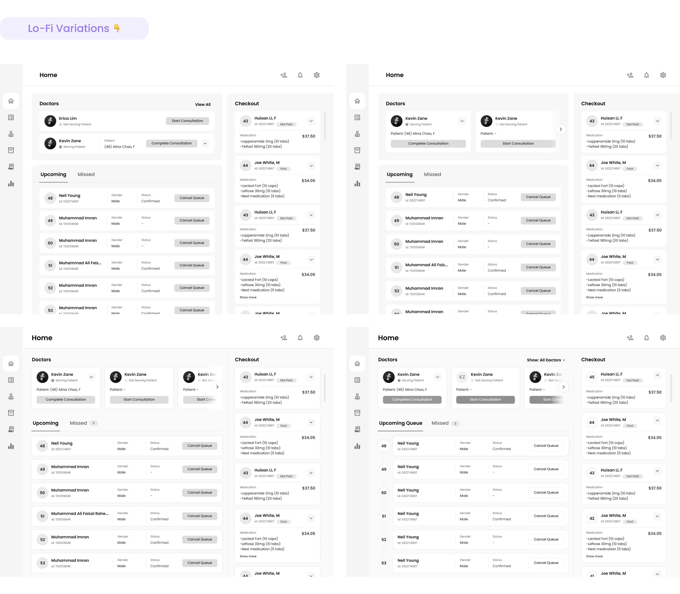
I worked on creating Low Fidelity screens keeping more details on the wireframes. I added proper content to visualize how the components would look like, and tried variations for the same. These Lo-Fi variations helped me understand the holistic view of the screens and made it easier for me to visualize how the elements and components would look like.
Sticker Sheet
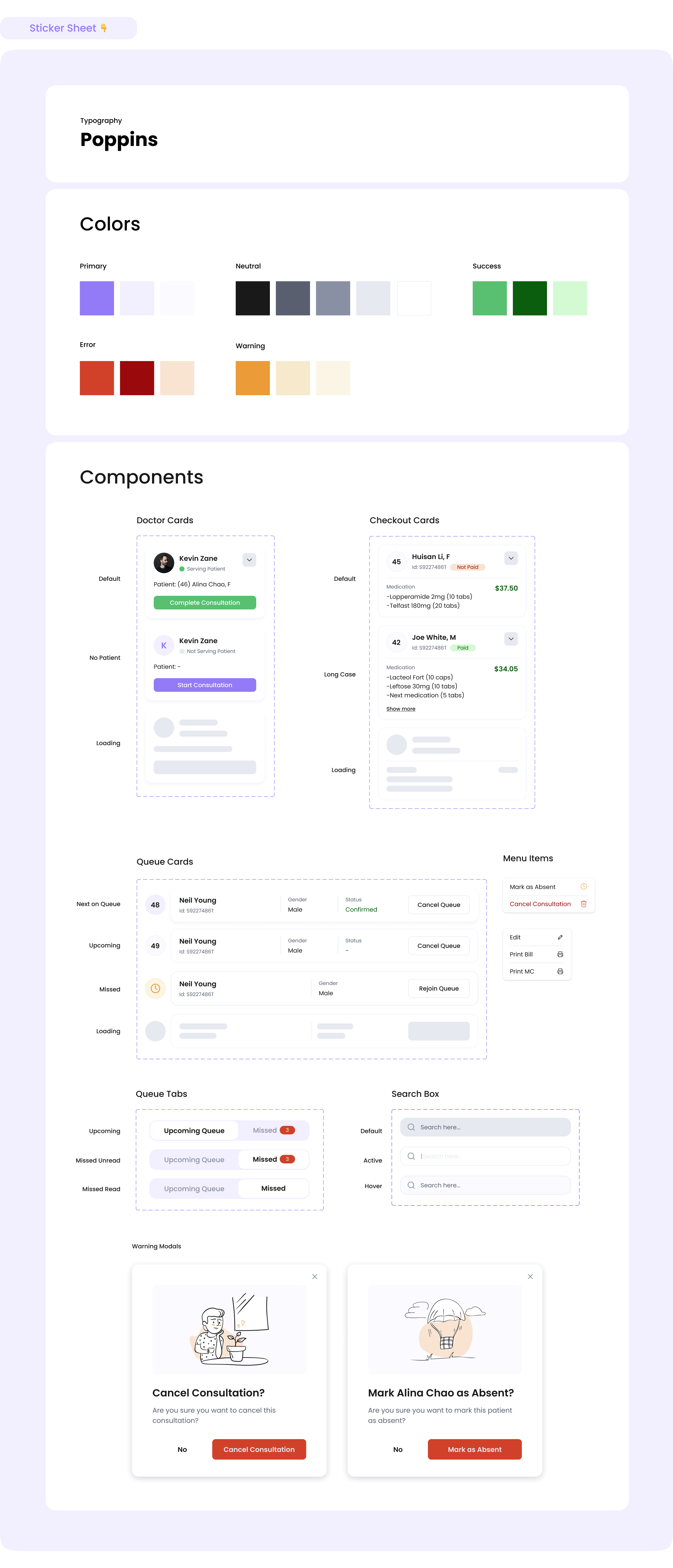
The Lo-Fi variations helped me choose a good variation to take it to High Fidelity designs. Having the Lo-Fi variations helped me decide faster on the components and their states. Then, I started creating components needed for Hi-Fi designs and created a basic sticker sheet with major components and their states.
Hi-Fi Variations
With a good sticker sheet having different components and their stated needed for the High Fidelity Designs, I created the Hi-Fi variations for the screens. From these Hi-Fi variations, I had to pick one to create a final High Fidelity Screens and Prototype.

Final Designs
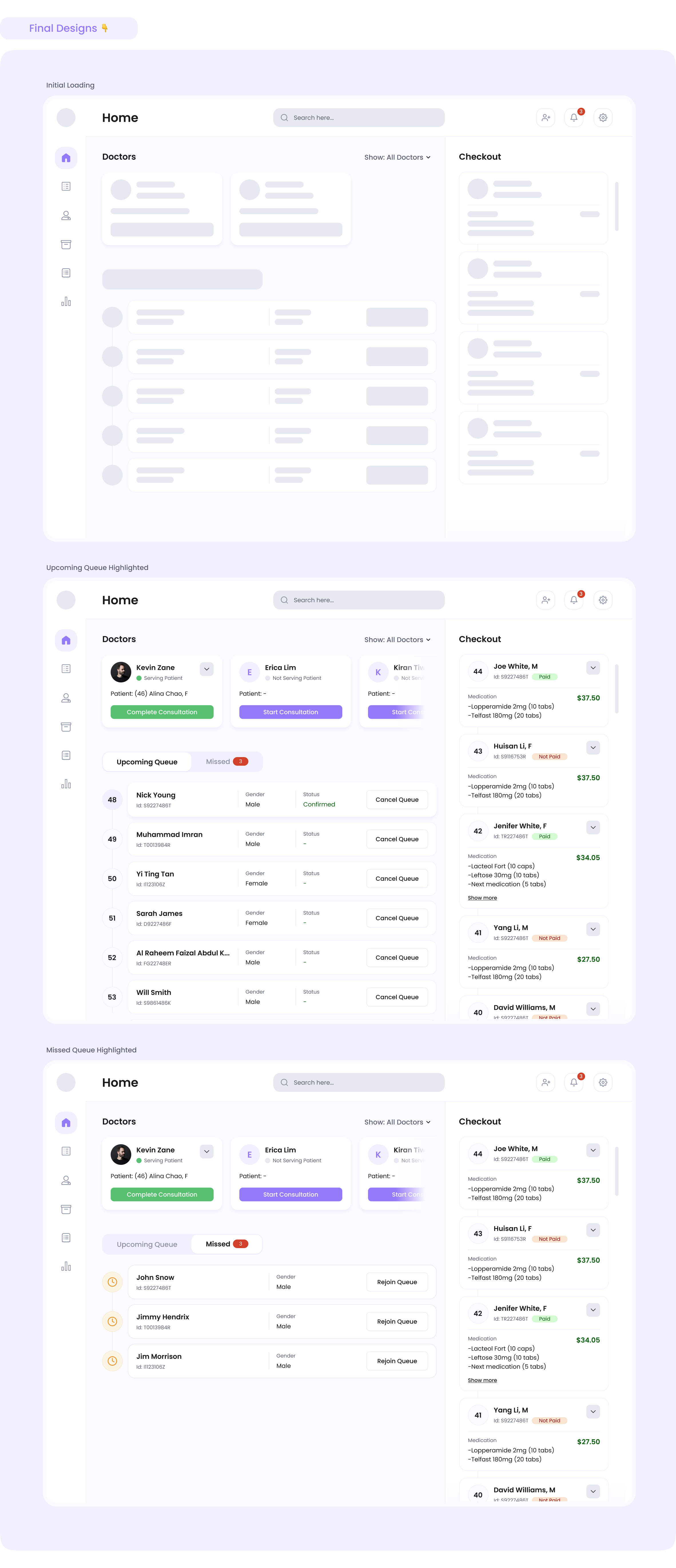
While at this stage, most of the things were done, I looked into the initial loader screen where I kept the shimmer effect for the component loader. I created the final set of screens for the Clinic Homepage. After this, I had to create a full fledge prototype of the screens including additional screens like confirmation modals, dropdown elements, and so on.
Full Video Prototype
You can see the full video prototype of the project on the following link.
Link: https://bit.ly/noak-video-prototype
Reflections and Next Steps
In conclusion, I enjoyed working on this project. However, because of time constraints, I couldn’t setup sessions with the users. Hence, I couldn’t do User Research, Persona Creation and Usability Testing.
Hence, for next steps we can perform;
- Usability Testing for different variations, and
- UI Improvements (Animation and Micro-interactions)
Thank you for your time!
Have feedback or want to connect?
Feel free to email me at mail.kirantiwari@gmail.com
Additionally, if you want to check out some of my other projects please follow along this link https://kirantiwari.com.np/portfolio/
